What story does this visualization tell?
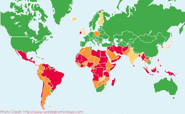
The informative and interactive world map from the Center for Reproductive Rights shows the legal status of abortion in different countries in 2013. It breaks down where abortion is permitted without any restriction, where it is limited to certain situations and where it is prohibited.
How does the data visualization strengthen the story?
The map gives a worldwide overview, which allows the reader to see the full extent of the legal situation. The reader can also clearly see the distribution of restrictive laws, and may discover that countries that they expect to have liberal abortion law actually restrict the practice. For an example Great Britain, Finland and Island limit abortion to socio-economic grounds while French Guyana and Uruguay have no restrictions as to reasons.
What makes the visualization effective?
One of my favourite features of the map is that it is searchable, so even if you do not know the location of a country you can find it. Another nice feature is that it allows the reader to compare the legal status of abortion in different countries. There are also short-cuts for easy navigation between world, region and country view. In addition to the overview there are links to more detailed material on 53 of the countries, such as detailed text about the specific laws and reports on the centers programs and interventions in various counties are also provided.
How can this story be adapted to the Kenyan context?
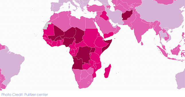
Abortion is a topical issue in Kenya, especially since the government released a report that estimates the numbers of unsafe abortions in different parts of Kenya. A similar map could be done on abortion laws in East Africa. A map could also be done on Kenya with a focus on facilities which are capable of performing safe abortions, the rate of abortions, the unmet family planning need, maternal deaths and the uptake of contraceptives.
To develop a version of this story for the Kenyan media, please contact us at datadredger@internews.org


