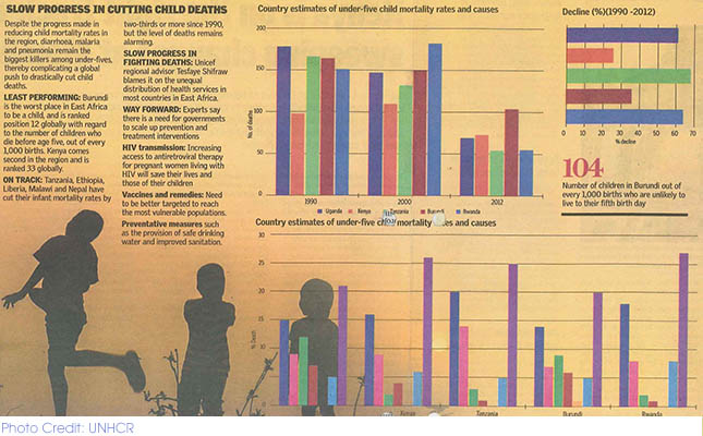
The use of data in various fields including journalism has been on the rise. But data journalism has not taken root in Kenya. This is why it was refreshing to see The East African make data visualization central to its story, Child death rates in EA: Newborns in Kenya, Burundi, have lowest chance of surviving until age 5. The appealing visualization clearly depicts the slow progress in cutting child deaths. The summaries that accompany the visuals were also very informative.
To learn how to analyze and visualize data, please contact us at datadredger@internews.org

