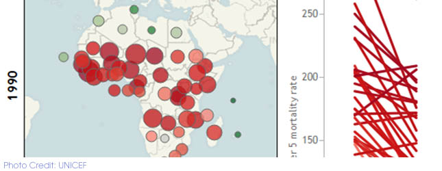
What is the visualization about?This interactive map shows improvement in the under-five death rate from 1990 to 2007. With simple interactive maps, a slope graph and textboxes, the map shows each... Read More
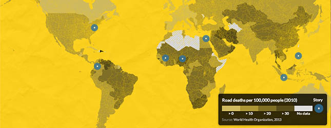
Roads kill map
What story does this visualization tell? The beautiful interactive map shows reported and estimated traffic accident deaths around the world. It breaks down the distribution of causes of deaths by... Read More
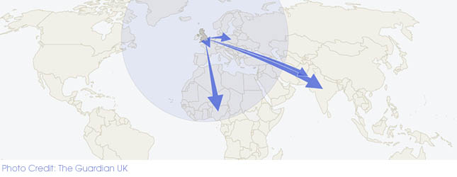
Remittances: how much Britain sends, and where the cash goes – get the data
The decision by Barclays Bank to pull out of the money transfer business in the UK gave The Guardian newspaper an opportunity to do an interactive story that throw the spotlight on the industry... Read More
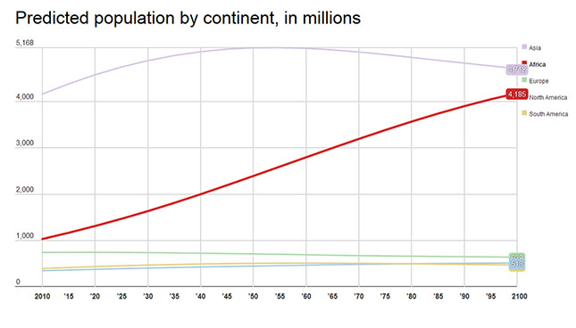
The amazing, surprising, Africa-driven demographic future of the Earth, in nine charts
What story does this data tell? The Washington Post seeks to explain new demographic projections by the United Nations Population Division that, "Africa will see a population explosion nearly... Read More


