Tag Archives: multimedia

Permalink to single post

Letting the numbers tell the story

Mercyyutube

The print story

Many journalists find it difficult to remain objective when covering controversial and sensitive issues like abortions.

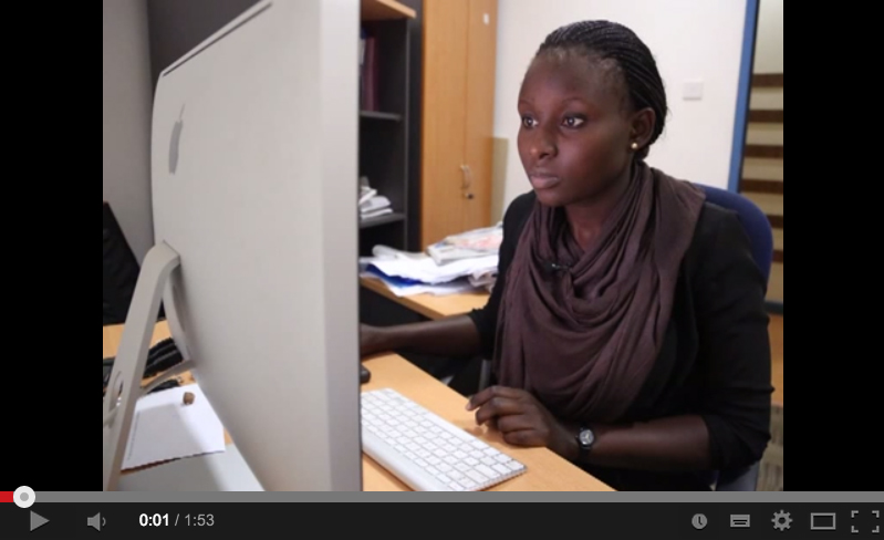
Internews in Kenya Data Journalism Fellow Mercy Juma, who is a TV journalist at NTV, used an evidence based approach to her story Grave Choices, on unsafe abortions.

The TV story

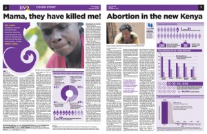
Her story was also published as a cover story in The Daily Nation’s DN2 and on the newspaper’s online platform as a multimedia piece.

She found a link between the unmet need for family planning and the high number of unsafe abortions in Kenya after comparing different datasets. Although the data had been openly available for several months no Kenyan
journalist had told this story.

In the following multimedia piece Mercy Juma reflects on the dilemma of reporting
on the issue, which is restricted in Kenya and prohibited by the major faiths.
Permalink to single post

How journalist conquered
his fear of numbers

fakeYoutubeScreenshot

The Tragedy of Unsafe AbortionsStarting out in data journalism can be overwhelming for journalists. But Internews in Kenya data journalism fellow Samuel Otieno, who works for The Star newspaper, has overcome his fear of numbers by learning statistics.

His decision paid off in a big way when he published a cross platform data driven story, Cost of unsafe abortion. The story looks beyond sensational headlines and delves deep into how universal access to contraceptives could reduce national health spending on post abortion care and the unnecessary death of women.

He shares his experience in the following multimedia piece.

Permalink to single post

‘Change for Health’:
The backstory

Watch the multimedia piece on Youtube

MisplacedprioitesMost journalists in Kenya are not taking advantage of the Internet to tell dynamic and interactive stories. But Internews in Kenya data journalism fellow Paul Wafula, who is an investigative reporter with The Standard newspaper, has broken the mold with his investigative story: Change for Health.

In the following multimedia piece Wafula explains how he used audio slides, interactive maps, infographics and a news app to tell the story of how much your county government is spending on developing your healthcare, the challenges and the misplaced priorities they face.

The app was developed by Internews data journalism fellow Dan Cheseret who is a developer. Apart from the online version, the story will be published as a five-part series in The Standard newspaper from today until Friday.

The News app, interactive maps and audio slides:
http://www.standardmedia.co.ke/health…

Alarm as 30 counties slash health budgets (12,November 2013) http://www.standardmedia.co.ke/health…

Misplaced priorities? Counties’ bitter prescription for ailing health sector (12, November 2013) http://www.standardmedia.co.ke/health…

New report reveals top and bottom counties in health spending (13, November 2013) http://www.standardmedia.co.ke/health…

False start as devolved units in once marginalised region fail balance test (13, November 2013) http://www.standardmedia.co.ke/health…

Kilifi County ranks low on health spending as disease ravages region (14, November 2013) http://www.standardmedia.co.ke/health…

Permalink to single post

Telling data stories with maps

Simple visualizations make large amounts of data easy to understand at a glance, allowing readers to engage more directly with the data. Choropleth maps are an iconic example of presenting data using colour intensity to illustrate prevalence rates. For example, blue signifies the high chance a child raised in the bottom fifth rose to the top fifth while red shows low chances.

In Climbing Income Ladder, Location Matters

But the process of making these maps is not straight-forward for non-developers. The journalist needs to evaluate the amount of detail given and whether the designer followed these steps in deciding what data to include in the map. » Read more